George Siemens hosted an online seminar to explore issues around the systemic deployment of learning analytics in mid October 2013.This post is intended to be equivalent in message my presentation at the seminar; I think the written word might be more clear, not least because my oratorial skills are not what they could be. The result is still a bit rambling but I lack the time to develop a nicely-styled essay. A Blackboard Collaborate recording of the online presentation is available, as are the slides I used (pptx, 1.3M, also as pdf, 1M).
The perspective is largely of ‘systemic’ being in the context of a higher education institution deploying learning analytics. There is, of course, a wider regulatory and political dimension to a systemic analysis, and this is touched upon but not explored. My understanding of the HE institutional context is based on work Cetis has done from 2006-2013 as an Innovation Support Centre for the Joint Information Systems Committee (Jisc), which aims to support both further and higher education within the UK.
According to the scope of the seminar I will be considering learning analytics. As I’ve written before I am cautious of defining terms but, when I have to, I take the stance that learning analytics is defined (and potentially redefined over time) according to the questions or decisions an educator cares about.
The position I take in what follows is also informed by the fact that Cetis is based in the Institute for Educational Cybernetics (IEC) at the University of Bolton. Cybernetics conjures up an image of robotics, but the development of cybernetics in the middle of the 20th century took a much wider view on problems of control, information flow, the relationship between structure and function of complex systems, etc which includes social and non-deterministic phenomena. IEC’s mission follows this wider conception, and is “to develop a better understanding of how information and communications technologies affect the organisation of education from individual learning to the global system.”
How Do I Feel About Systemic Learning Analytics?
I hope it doesn’t sound too peculiar to be talking about feelings…
Mihály Csíkszentmihályi’s flow model provides a convenient, if academically un-justifiable, reference point for me both to describe how I feel about learning analytics as an individual with some practical analytical ability and to to describe how I feel about how the post-compulsory education community is approaching learning analytics. Asking these questions in our discussion groups – where am I and where are we – and an exploration of why would make a useful overture to more practical discussion of what to DO about learning analytics.
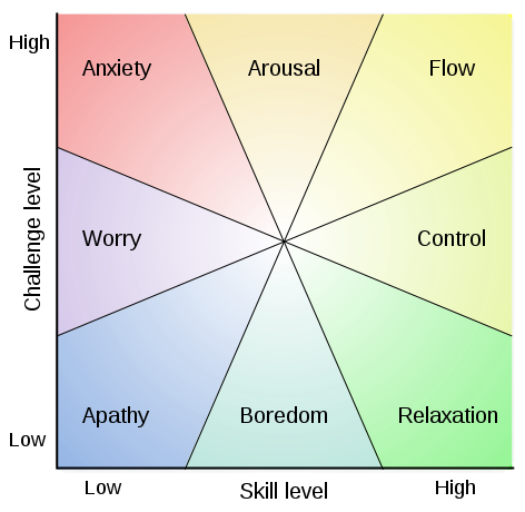
My self-assessment is “anxiety” about how the community at large is approaching learning analytics. By this I mean to say that my perception of the level of skill we collectively have is low and the challenge level is high. My sense from what I hear and read is that quite a few prominent voices would estimate skill as being higher and challenge as being lower. This difference only makes me more anxious. It is conceivable that the difference between these estimates and my own arises from alternative conceptions of what we are aiming at with learning analytics. Although this might betray some arrogance, I would put myself on the anxious/aroused boundary.
The rest of this post can be thought of as an exploration of skill, challenge, and aim, and why I am anxious.
Practical Issues
Some evidence on perception of obstacles to adoption of analytics, and of the capabilities that are in place (or otherwise) is available. EDUCAUSE published a report into their survey of analytics readiness in US universities in 2012 [1] and we published the findings of our own survey in 2013, which was UK-specific and of quite small scale. Both considered analytics generally and were not specific to learning analytics.
The relevant summary charts from each publication are:
![What is in Place? From [1]](https://www.hilltop-cottage.info/blogs/arc12/wp-content/uploads/2013/10/ECAR-Report-Fig8-What-is-in-place.png)
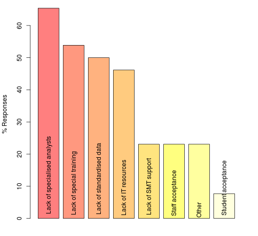
Both surveys have qualitatively similar findings in the areas where they overlap (we did not, for example, ask specifically about funding/investment), although the issue of staff acceptance is a clear difference and is one where we doubt the findings of our survey.
In contrast to many initiatives involving data and IT systems, senior leader interest is not an issue. In our survey we also asked about levels of awareness of developments in analytics outside the education sector and found that our respondents believed this group had the highest level of awareness.
Analytical expertise is clearly perceived as a key obstacle or capability that is not in place, with a number of data-related factors being in need of attention, leading [1] to recommend:
Invest in people over tools. Recognize that analytics is at least as much about people as it is about data or tools. Investment needs to begin at the level of hiring and/or training an appropriate number of analysts to begin addressing strategic questions.
Both surveys indicate scope for some direct investment and examples can be found of organisations that have anticipated this recommendation. I quite like the way the Open University has approached the problem by building capability within and around their student survey team and engaging with academic staff. One of the presentations in the online seminar explains where OU is going with its systemic organsisational analytics infrastructure.
The capability gap could be partially filled, or compensated for by various realisations of the idea of a shared service. In the US, the PAR Framework, which describes itself as being ‘a non-profit multi-institutional data mining cooperative’ benefits its members by providing individual risk models as well as aggregated anonymised data. In the UK, two organisations with a great deal of data from across the whole HE sector continue to develop their offerings, backed up by their in-house analytical expertise: the Higher Education Statistics Agency (HESA) and the Universities and Colleges Admissions Service (UCAS). Both organisations have historically focussed on benchmarking and statistical analysis for policy but are well positioned to offer diverse services direct to institutions based on their sector-wide data, potentially linked to institutionally-owned information subject to suitable protocols.
So, We Need to Hire Biddable Experts, Right?
Well… yes, and no. I think there are dangers in a response to the challenge of establishing systemic analytics that is exclusively based on a centre of expertise model.
Jeanne Harris wrote in the Harvard Business Review blog on the topic under the heading ‘Data is Useless without the Skills to Analyze it‘ in 2012:
…employees need to become:
Ready and willing to experiment: Managers and business analysts must be able to apply the principles of scientific experimentation to their business. They must know how to construct intelligent hypotheses. They also need to understand the principles of experimental testing and design, including population selection and sampling, in order to evaluate the validity of data analyses.
…
Adept at mathematical reasoning: How many of your managers today are really “numerate” — competent in the interpretation and use of numeric data?’
The message that I take home from this post is that, for all we perceive the business world outside higher education to be more advanced in its adoption of analytics, there has been a lack of attention to the need for a certain level of critical thought and expertise among those who receive the results of analysis. I am reminded of comments made by my colleague Phil Barker back in 2008 about the book Rethinking Expertise by Harry Collins and Robert Evans. Phil commented that:
The novel idea in the book was that it is possible to have “interactional expertise”, which is the ability to talk sensibly to domain experts about a topic (e.g. gravitational wave physics) without being able to make a contribution. It is implied that this level of expertise would be useful in the management of projects and setting of public policy that have scientific or technical elements.
Rather than follow the business world into this deficiency, we should avoid it. ‘But…’, I hear someone say universities already have people who are experts in scientific experimentation, testing, design of statistical tests, mathematics, hypothesis generation and testing, …
Read on.
Our Experimental and Mathematical Expertise is Not Where We Need It
Yes, we do have people who are experts in scientific experimentation, testing, design of statistical tests, mathematics, hypothesis generation and testing, … but, they are busy teaching students and doing research (possibly in areas that do not easily translate to learning analytics methods).
The consequence seems to me – and it is an impression based on observation rather than investigation – is that we are importing bad habits from the business world and using inappropriate products peddled to us by the IT industry. The level of expertise I think we should have fairly well distributed throughout our organisations, wherever data-informed decisions are being made, should be such that each of the following examples is challenged. Until then, I fear we will have an inadequate level of data/analytical literacy for meaningful systemic [learning] analytics. I call this level of appreciation of analytics, and ability to comprehend and query validity, “soft capability”. It is a counterpart to the kind of expertise necessary to originate analytical method or deal with most practical data, for which most universities will have to hire talent.
3D Visualisations and False Perspective
3D visualisations may be useful for specialised information visualisation tasks but for presentation of common numerical data, they introduce distortion that fundamentally undermines the purpose of visualisation: to appeal to our “visual intelligence”, giving near-instantaneous apprehension of proportion, pattern, relationship, etc.
The pie chart is generally considered to be a poor way to visualise relative proportions – it is much easier for most people to judge this from the length of bars – but to compound this with false perspective of a 3D representation is surely to be avoided. And yet, it is easy to find examples from people who are proficient at handling data.
In my world of adequate soft capability, reports containing 3D and perspective would be sent back to the creator.
Sparklines – is Edward Tufte in Despair
The introduction of sparklines is ascribed to Edward Tufte, introduced in his book Beautiful Evidence (for more information, see Tufte’s excerpt and notes on theory and practice of sparklines). Tufte described them as ‘data-intense, design-simple, word-sized graphics’ and described how to maximise value within the minimalist context.

Unfortunately, although the sparkline idea found its way into Excel2010 and into many business intelligence dashboards, it has become debased to be simple squiggle that is often lacking the features Tufte devised to concisely convey normal range, scale, proportional change, and range of data.
In my world of adequate soft capability, people would complain about dashboards and visualisations lacking enough information to judge scale of change, range of duration, suppressed zero, etc.
Significance and Sample Size
Whereas the previous two cases do not require a knowledge of statistics to produce, questions of significance and sample size are slightly more difficult concepts to apply because of the need to know some statistics, but the basic non-statistical question is: how does what we observe differ from what we would expect by chance alone. This question is rarely asked by the recipients of analytical reports. Worse than than, too many reports fail to indicate the significance, or otherwise, of findings in relation to the hypothesis that there is no real change/difference that cannot fairly be ascribed to chance (with a certain level of confidence).
Here is an example, made-up but based on a real example of a report of a student questionnaire and believed to be similar in its deficiency to many end-of-module survey reports: ‘Flagged for action because 72% of students felt they were well supported by their supervisor compared to 80% in similar institutions (difference >5% action threshold)’.
A threshold for action of 5%, picked out of thin air without reference to sample size or baseline value (80%) is not defensible. If the sample size were only 25 then 72% equates to 18 satisfied responses. If we assumed these 25 students had been randomly sampled from a population with an 80% satisfaction then there is actually around a 22% chance that there would be 18 or fewer responses of “satisfied”. Worthy of action? Probably not.
In my world of adequate soft capability, people would always ask: “how does what we observe differ from what we would expect by chance alone?”
Significance and Baseline
Here is a further, more subtle, example where a failure to address the difference between what you would expect by chance and what you observe leads to misleading conclusions.
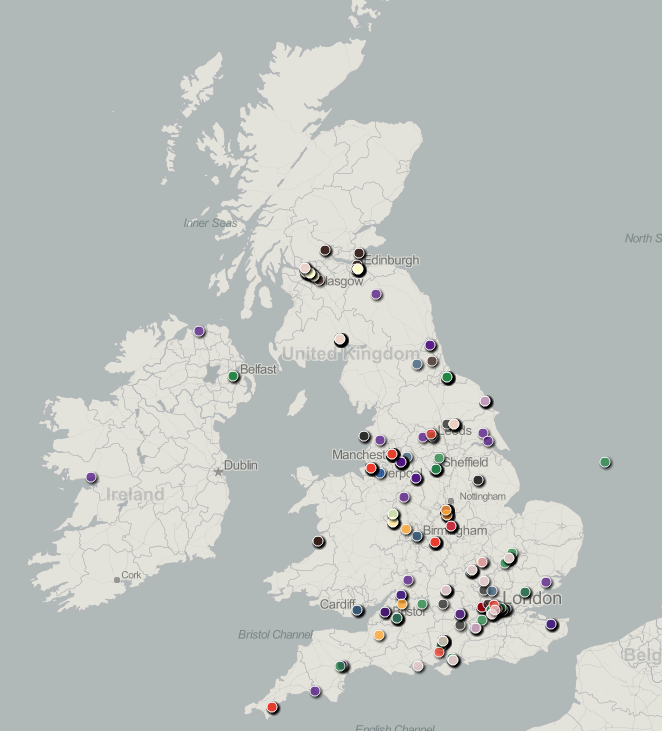
Now, as it goes, this is a reasonable qualitative indicator of Cetis’ reach in the UK (and a number of continental points have been cropped) but much of the geographical distribution reflects UK population density rather than anything more interesting about Cetis. In this case, there are too few data points to sensibly answer the question: ‘so how does that differ from what you would expect by chance?’ To do that, we might need to find out the distribution and staff-size of universities, to which most (but not all) of our community belong.
A more current example might be MOOC participant distribution. How different is the distribution of participants compared to what would be expected from the distribution of speakers of English with easy access to a computer and internet connectivity? This isn’t to say that a plain map showing the distribution of participants is valueless, but it is to say that if we are claiming to be doing analytics on the distribution of people it may be valueless or worse, misleading. (NB I don’t see this as black-and-white, a plain map would be useful to better understand statistics such as average travel distance to class, for example)
In my world of adequate soft capability, people would ask: “how does that Google Map overlay of participants differ from population density?”
The Benefits of “Soft Capability”
The primary message of the preceding sections is that, in order for learning analytics to be sensibly acted upon, there should be an adequate supply of expertise tuned to critical engagement with the method and outputs of analytics. I call this a “soft capability” to distinguish it from the necessity to also have people who can run the IT systems and wrangle the data, which are “hard” both in the sense of being easier to identify and quantify, and more technically difficult. The essence of soft capability is that it exists in people who have contextual knowledge. This is essential to bridge the gap from numbers and visualisations to action. This must happen before systemic learning analytics, if we are to take “systemic” as being a meaningful transformation rather than an imposed, and doubtless often circumvented, process . As Macfadyen and Dawson [2] conclude in their interesting paper about the difficulty in bridging the gap between numbers and strategic decision-making:
Interpretation remains critical. Data capture, collation and analysis mechanisms are becoming increasingly sophisticated, drawing on a diversity of student and faculty systems. Interpretation and meaning-making, however, are contingent upon a sound understanding of the specific institutional context. As the field of learning analytics continues to evolve we must be cognizant of the necessity for ensuring that any data analysis is overlaid with informed and contextualized interpretations.
Informed decision-making this is not the only benefit of establishing soft capability. It can also greatly increase the effectiveness of collaborative design. Such a process is enriched by people who have enough skill to prototype and explore through to people who might only ask ‘so how is this different from what we would expect by chance?’ or ‘what assumptions have you made about …?’. It becomes possible to greatly increase the quantity and quality of participation in the design of systemic learning analytics.
A Side-bar: Variety, Control, Organisation, and Boundaries of Decidability
In the introduction, I referred to the mission of the department I belong to, the Institute for Educatoonal Cybernetics, which was “to develop a better understanding of how information and communications technologies affect the organisation of education from individual learning to the global system.” One of the lenses we use to look at this problem is cybernetics, which was developed into a multi-disciplinary field from the middle of the 20th century. The idea of “system”, the role of information, and effective forms of organising systems-within-systems has been applied to machines, management, psychoanalysis, … . The view of “system” is inclusive of social and technical components; the behaviour of a system cannot be understood without embracing the whole (socio-technical) and apprehending that systems have properties that arise from the relationship between individual components of the system, not just from the summation of properties individuals.
“Variety” is a building-block concept, which can be explained as the number of possible states of a controller or controlled-entity (see Ashby’s Law of Requisite Variety, below). Approximate colloquial equivalents from the point of view of a controller without requisite variety might be “I don’t have the bandwidth for that”, or “I don’t have the head-space for that”. The appearance of “control” might appear odd, evoke a response that education is not about control. But it is. Not total control, but the purpose of education is to develop, steer, bring-out (etymology of education is from “educere”, to lead out).

Turning Ashby’s Law around suggests limits on the extent of control that a controller should be applied. The teacher does not, and should not attempt to, control the learner in all respects. One of the features of effective education is the degree to which the learner can progressively increase their self-regulation and their own variety as learners: good habits and metacognition. The same thought applies throughout the whole educational system; an effective and viable system adopts a recursive structure of control and inner regulation, right down from the state, the institutional management, the teacher and the learner.
If we are thinking about learning analytics then we should ask which questions are decidable from data. In education, things are already bad enough. The outcomes we care about – developments in the learner – are only ever guessable. Even if you could lurk on their shoulders as an invisible demon observing all actions, you would still have to make inferences about what intervention in their learning process would be fitting. The data we have is one further step removed from the learner; one must use it to infer what the learner was doing before then using these inferences to infer how what they were doing relates to their learning. The information about the state of the learner that is available is necessarily incomplete; even the highest-variety controller cannot access the necessary number of states. Even if there is complete instrumentation and capture of every action of the learner, there is much that remains unknowable. Informed action is bounded.
This fundamental problem suggests that our ambition for learning analytics should be tempered with scepticism that having Big Data can reveal much just because of its scale. We should first recognise the variety gained through experience as a reflective educational practitioner or experienced educational researcher, second the attenuation of information when people are interacting (in a suitable affective state). What appears to be intuition is complex pattern matching.
There remains a great deal of data that an educator lacks the variety to deal with. Information where quantity is high but each item is relatively simple. This is where analytics comes in to its own, so long as we bear in mind that the system is socio-technical; it includes pedagogic practice. The most effective learning analytics is, according to my analysis, likely to be where it can reduce large volumes of data to simple context-specific and [pedagogic] practice-relevant facts.
The Management/Practice Accommodation
As noted in the previous section, the concept of variety can be used to explain why organisational structure is necessary; the finite variety of a controller limits what it can control and structure within a system allows action to be taken on units that are in other ways self-regulating and self-organising. Many organisations limit the extent of self-regulation and self-organisation because the the (implicit or explicit) management theories of senior staff or because of imposed accountability. This can lead to undesirable and unintended consequences. For example, the setting of targets for healthcare by the UK Government focussed attention on specific measures such as waiting time distorted management in the NHS away from managing their system as a whole. The availability of this data, which is justifiable on the grounds of public good (transparency and improvement through research on health-care delivery etc), enabled government intervention. They should have been wise enough to seek measures of control that do not involve reaching inside the cab and pulling levers.
To turn to education, the boundary between what has been the provenance of management and teachers has evolved over time. How this has happened in Higher Education (in the UK in particular, but not exclusively), and the likely disruptive effect of learning analytics has been explored in one of the Cetis Analytics Series papers by Dai Griffiths [3], in which he says:
The introduction of these techniques [Learning Analytics] cannot be understood in isolation from the methods of educational management as they have grown up over the past two centuries. These methods are conditioned by the fact that educational managers are limited in their capability to monitor and act upon the range of states which are taken up by teachers and learners in their learning activities. … Over the years, an accommodation has developed between regulatory authorities, management and teaching professionals: educational managers indicate the goals which teachers and learners should work towards, provide a framework for them to act within, and ensure that the results of their activity meet some minimum standards. The rest is left up to the professional skills of teachers and the ethical integrity of both teachers and learners.
Now, it might be contended that the accommodation should be challenged, that there is benefit to be won from changing where we draw the boundaries of the sub-systems and consequently the information transacted. I see the issue not as being that change is bad – indeed, resistance to change may well be self-desctructive – but that threats may arise in moves towards systemic learning analytics:
- Changes in the management/practice relationship may be introduced without consideration of what makes for an effective and viable structure. There is a temptation to pull levers.
- Systemic learning analytics may be attempted too quickly and either lead to the imposition of a new relationship rather than the settling of a new accommodation or to change that exceeds the pace by which evidence of effect can be gathered.
Systemic learning analytics brings with it a risk that educational systems may be made less effective if the focus is on management control and subtlety is lacking.
So You Want to Optimise Student Success?
On the face of it “do you want to optimise student success?” sounds like a classic rhetorical device. How could anyone disagree? What follows in rhetoric is a proposed response. Everyone cheers at the most charismatic orator and we all go away feeling good to be part of such a worthy project. The expression is widespread; put “optimize student success” analytics into your favourite search engine and take a look.
There are two aspects of this expression that trouble me. The first is that what constitutes success is largely taken as a common-sense concept, whereas I contend that it is; a) a contested concept, b) personal to the student, c) unknowable because it is an integral over the lifetime of the student (which is likely to include jobs we cannot yet conceive of). Too many high profile pronouncements about learning analytics fail to even acknowledge this problem. Its not that no-one has thought about it. Many have (I particularly like Ruth Deakin Crick‘s line of research).
At least some reflection on what constitutes success would be nice. For example, here are four views (the first 3 are similar to the measures used by Ofsted, which has responsibility for school inspection etc in the UK):
Attainment: an academic standard, typically shown by test and examination results.
Progress: how far a learner has moved between assessment events.
Achievement: takes into account the standards of attainment reached by learners and the progress they have made to reach those standards.
Enrichment: the extent to which a learner gains professional attitudes, meta-cognition, technical or artistic creativity, delight, intellectual flexibility, …
Without drawing distinctions among the first three objective measures or considering what lies within the fourth and how we might recognise it, can we really go forward? We have, so far, muddled along with education – which I see as a process not a thing – without being very clear about these things except where school inspectors made us take notice or in university Education Departments. The conservatism of the education system, and society’s view of it, has partially protected it because habits and practices have persisted. These lead to intangible, or unmeasured, desirable consequences because they have been saved from objectivist and industrialist thinking. Optimising student success without exploring what success is risks causing damage by attending to a narrow or inarticulate view of “success”. This is not a new problem, but it is one that analytics could make a lot worse.

There is a second issue with optimising student success at institutional level compared to the individual level. The marketing, evangelism and high profile statements tend to be at the level of the institution and not the individual. There is an ethical tension here (refer also back to [3] and Dai Griffith’s quotation above); if success is judged by a completion rate, for example, interventions will focus on marginal students, with “no hopers” and top students comparatively neglected. So long as the management/practice accommodation remains, there will be insulation against this tendency because of the ethos of “the teacher”.
The phrase “maximise the probability of [student] success” falls into this ethical trap when applied at the group/department/institution level, whether intentionally or not, because it mis-specifies the problem by turning success into a binary outcome. It invites selection of the students most likely to attain a threshold, whereas seeking to increase the aggregated progress of individual students invites selection of those most educationally-disadvantaged, for whom there is the greatest potential for progress. There are better ways to specify aims and objectives.
Actually, I believe “optimise success” is fundamentally under-specified, even if we replace the idea of success with a neat objective measure of attainment, because the constraints are not specified. Optimisation maximises or minimises something with respect to limited resources by choosing the most effective method, or finds a trade-off between costs and benefits (which are somehow measured and weighted). “Optimise success” must, therefore, be qualified to be meaningful and this qualification is not an implementation detail, it should be right up there with the headline strategic statement.
Worried?
At this point, you might be saying “yes, but everyone knows about these issues; hardly anyone is going to do systemic learning analytics like you suggest”. I hope so, but its a faint hope, because most of what I read and hear does make me worried. The following chart from the EDUCAUSE report on their 2012 survey underlines this impression, that the people likely to be making decisions about analytics in HE are not concerned about much of what I have talked about above (with the possible exception of “HE doesn’t know how to use data to make decisions, which could be seen as touching on my claims for soft capability).
![From: “Analytics in Higher Education: Benefits, Barriers, Progress, and Recommendations” [1]](https://www.hilltop-cottage.info/blogs/arc12/wp-content/uploads/2013/10/ecar-report-concerns.png)
Potential Misadventure and Bad Role Models
Here are four further snippets I think are worth considering when systemic learning analytics is proposed.
For What is this a Good Metaphor?

The business intelligence vendors latched onto the dashboard metaphor some time ago now, and the idea of a simple and easy to understand and act upon visual representation of the state of a complicated system is appealing. It works for cars but look at the image. Enumerate the actions. There are not many and they are simple, arising from managing fuel vs planned journeys, stopping when there is an engine fault, cancelling indicators, etc . I doubt most people even use their rev counter.
A dashboard is conceivably useful to summarise prosaic aspects of teaching and learning such as task completion, level of engagement, or progress towards attainment targets but implemented dashboards are often cluttered and lack the simplifying characteristic. Maybe it is because they are trying to be more ambitious and to deal with that slippery character “learning” but a 777 cockpit style visualisation of a bundle of parameters doesn’t cut it. BI dashboards often have the same problem with clutter and complexity. They indicate design without clarity about which actions they are intended to support.
Automation and Practice
In the section on variety, I touched upon two points that I will now relate to a specific example. I do not mean to imply that this example is particularly worthy of criticism compared to similar kinds if initiative but an example will help to show the potential for misadventure.
The example is the E2Coach (Michigan Tailoring System), which was the subject of the first talk in the symposium. The essence of E2Coach is the provision of automated guidance to students and it is clear that the development of the system at Michigan was thorough. Let us assume that it is no more or less likely to provide what turns out to be wrong guidance than a member of staff would. After all, we accept that the humans are fallible.
We can look at this system as relieving pressure on teaching staff by automating the provision of the same advice that they would probably have given anyway. It reduces the variety required of the teacher to manage certain aspects of the students’ study, freeing this time for other activities. These might be more valuable activities but still, the question to be asked is whether there was anything else going on in the face-to-face interactions that was valuable and is now lost. What about those serendipitous conversations, or the affective benefit of interpersonal contact? How many issues are there that would only be picked up by the sensitivity of a human being?
The point here is that there are potential pitfalls from disembodying parts of what goes on without considering how these parts relate to practice. A systemic view should consider automation within a system that includes teaching practice and explore how the whole will be changed. Hypotheses about change can be explored by observation, role-play, and possibly social simulation. Most importantly, the post-hoc effect on wider practice and student experience should be explored in addition to studying the immediate effectiveness of the automation.
The Folly of Technological Solutionism
I’ve recently discovered Evgeny Morozov and his new book, “To Save Everything Click Here: The Folly of Technological Solutionism”. While he says much that is open to dispute, or about which I am not entirely convinced, i think he identifies a very real problem and explores it with insight. In addition to mentioning education within the first ten pages, Morozov says the following about technological solutionism which I think pertains well to the adoption of learning analytics:
Recasting all complex social situations either as neatly defined problems with definite, computable solutions or as transparent and self-evident processes that can be easily optimized—if only the right algorithms are in place!—this quest is likely to have unexpected consequences that could eventually cause more damage than the problems they seek to address.
I call the ideology that legitimizes and sanctions such aspirations “solutionism.” I borrow this unabashedly pejorative term from the world of architecture and urban planning, where it has come to refer to an unhealthy preoccupation with sexy, monumental, and narrow-minded solutions—the kind of stuff that wows audiences at TED Conferences—to problems that are extremely complex, fluid, and contentious … solutionism presumes rather than investigates the problems that it is trying to solve, reaching “for the answer before the questions have been fully asked.” How problems are composed matters every bit as much as how problems are resolved.
This reminds me of Martin Heidegger’s comments in “The Question Concerning Technology and Other Essays”, (original 1954, quotation translated by William Lovitt 1977):
Everywhere we remain unfree and chained to technology, whether we passionately affirm or deny it. But we are delivered over to it in the worst possible way when we regard it as something neutral; for this conception of it, to which today we particularly like to do homage, makes us utterly blind to the essence of technology.
We cannot escape the fact that our technologies – which I would take to include farming and the most basic tool-using – influence the way we think about the world. Heidegger was pessimistic about where technology was going to lead us. So far, I think he was over-pessimistic but that does not mean we should not be blind.
The “What Works” Trap
The phrase “what works” has been cropping up more over the last few years, often associated with “evidence-based policy”. For example, the UK Government published a policy paper entitled “What Works: evidence centres for social policy” in March 2013. The USA has its What Works Clearinghouse, which “…by focusing on the results from high-quality research, we try to answer the question ‘What works in education?'”.
Now, I am all for the idea that evidence is important and I hope the link to talk of analytics is clear but there is a large trap in the language of “what works” and in decision-making paradigms that are data-driven.
The language of “what works” and the presentation of it is problematical because it makes a singular “best practice” out of what should be contexualised information. For example, there is ample evidence that intelligent tutoring systems “work”. The LearnLab can demonstrate unequivocal learning gains from applying some neat artificial intelligence techniques to cognitive theories of learning. The problems arise when this evidence is taken out of context and the tool – the cognitive tutor – is applied to a context it is ill-suited to because a policy-maker has not a nuanced view.
Politicians especially, and senior decision-makers too, like simplicity and clarity. Politicians like defensible positions. Research that shows what works is attractive. They key question is whether the research is defensible, whether the evidence has a sound epistemological base. In the UK, and over educational questions in schools in particular, the current view of the most influential people is that randomised controlled trials (RCTs) are the gold standard. There is, in my view, inadequate attention given to the cases where RCTs are unreliable and the emphasis given to them, coupled with their extensive use in medicine and the way they acquire status by reflecting methods in experimental physical science, leads to poor experimental design and evaluation in social and educational settings due to un-reflective research methods. False confidence in misleading evidence is a recipe for causing harm. Intuition may be a better friend.
I have strayed into policy and government here, which is not the main focus of this piece, but the I hope the possible misadventure from applying learning analytics extra-institutionally is clear. Evidence-based policy is fashionable but, too often: the scope & context of applicability is significant yet marginalised; models of cause and effect are unexplored or ignored; there is a failure to recognise that the evidence relates to groups, not individuals, in cases where action should often be specific to individuals.
This blog post is not the space to explore this issue properly, or to argue the case, but (as elsewhere) I would like to give a call-out to some people who have described the issues rather more clearly and who explain how to deal with the issues.

The most evaluated intervention in criminal justice has been mandatory arrest for domestic violence as a means of reducing rates of repeated assault. … Police officers attending calls for service where domestic violence was reported, and where there was no serious injury, were randomly allocated one of three responses. One of these was to arrest of the perpetrator though he was not necessarily charged, the others were either to provide advice or simply to send the perpetrator away.
There was a statistically significant lower rate of repeat calls for domestic violence amongst the group where arrest occurred (10% of repeat incidents within six months) … On the basis of this finding other cities were encouraged to adopt a mandatory arrest policy in relation to domestic violence as a means of reducing repeat assaults… In six follow-up studies [in US cities] … the results were mixed. In three of them those randomly allocated mandatory arrest experienced a higher rate of repeat domestic violence than those randomly allocated alternative responses… What this means is that those cities that adopted the mandatory arrest policy on the basis of the first conclusions look as if they have increased the risks of domestic assault…
Why were there these mixed findings? Sherman suggests that they can be explained by the different community, employment and family structures in the different cities. He suggests that in stable communities with high rates of employment arrest produces shame on the part of the perpetrator who is then less likely to re-offend. On the other hand, in less stable communities with high rates of unemployment arrest is liable to trigger anger on the part of the perpetrator who is liable thus to become more violent. The effect of arrest varies thus by context. The same measure is experienced differently by those in different circumstances. It thus triggers a different response, producing a different outcome. The effectiveness of the measure is thus contingent on the context in which it is introduced. What works to produce an effect in one circumstance will not produce it in another.

Avoiding the trap requires that we pay a lot more attention to what is knowable, the experimental or data-collection environment, and the models of cause and effect we bring to interpretation. We need to consider the evidence for the evidence – “what works for evaluation” – if we are to acquire useful knowledge (things we can act on as it they are objectively true without having to worry whether they are really objective).
Rays of Sunshine
You might be forgiven for labelling me in the “anti” camp from the preceding text. Far from it. I think there is a great deal of potential for learning analytics to shine a light on what we do in education and expose where convention or hear-say is a poor guide. Decisions are often made today without recourse to evidence while data that could be used to increase evidence goes unused. Learning analytics offers us a means to understand and to recognise a wider range of learning activities, broadening the toolkit of assessment and the scope of what is valued. It has the potential to make learners and teachers better informed about the efficacy of their actions.
I am “pro” but worried that in five years someone will turn to me and say “I remember you were keen on analytics in 2012, now look at the mess we’re in”. To which “that is not what I meant” would be a lame reply. The over-arching threat to efficacious systemic learning analytics is, I think, to follow the path of business intelligence. The habits of management reporting, dashboards and the way BI has often been implemented without really acknowledging what people do in practice are recognised as issues by thinkers in the business world. We should avoid this path and also be very cautious about adopting the language of KPIs for learning, teaching, and the management of education. The language of KPIs and learning metrics risks narrowing focus and the false presumption of repeatability and regularity: an industrial perspective on “systemic”. Where we do use various measures of activity or performance, we need to be wary of the limitations of what is knowable from them: we must not be epistemically blind.
I should finish with some “rays of sunshine”, some positive comments and examples of how some of the issues can be overcome.
I have already mentioned Nick Tilley and Ray Pawson, and Phil Winne, and I think they give us some good pointers. Tilley and Pawson emphasise experimental design and data collection that accounts for the mechanism of change rather than considering only the effect. They make the case that without attending to mechanism, it is likely that attention will not be paid to the relevant attributes and their relation to candidate interventions. In their case, interventions to reduce crime were of particular interest, but the same approach is applicable in institutions where the interventions have educational aims. Phil Winne shows the importance of data at scale, coupled with the design of a browser plugin to capture relevant data (not incidental data).
A counter-measure to reduce the risk of mis-adventure and to dodge the pit-falls is needed. I think this is possible if we, the community of people talking and writing about learning analytics, take more time to articulate the role of method, not only the outcome, of successful systemic learning analytics. In other words, the most important thing is not the improvement in completion rates, or whatever, but how the project was undertaken. The following are my list of “how” that I have seen working to good effect (note, I don’t say they are “what works”):
- Organic development & prototyping, starting with spreadsheets and more manual processes before embarking on IT infrastructure or systems projects.
- The principle of parsimony (or “Occam’s Razor”) is a statistical mantra for good reason; it is easier to judge the reliability of a simple method.
- A realistic approach to the scale/quality of your data is important. Do not assume that apparent bigness will counteract error and bias.
- Design and develop with the educator IN the system.
- Optimise the environment for learning, not the outcomes of learning. This keeps attention on the fact that learning is a process and not an outcome, and that the outcomes we measure are not real.
- Reflect on the effect LA innovation has on practice
- Embrace an action-research (or action-learning) approach. This is an evolutionary and iterative approach rather than a buy (or build) and then operate.
Of all the feted early adopters of learning analytics, Course Signals, is an example of all of the above points. On the whole, though, Signals has received less praise for its methods than it should. They are unusual, for example, in having discussed the effect of Signals on practice in their publications. It remains to be seen how relatively successful institutions will be that buy the productised version from SunGard (now Ellucian Course Signals). My contention is that what Purdue gained by doing it cannot all be bought off the shelf and that the most successful institutions at employing learning analytics systemically will combine purchased LA with an environment for innovation and change that embodies many items on the list, above.
References and Further Reading
Although I usually prefer linked text, there are some references where a more conventional form of citation is to my taste.
[1] Jacqueline Bichsel, “Analytics in Higher Education: Benefits, Barriers, Progress, and Recommendations”. Available from http://www.educause.edu/library/resources/2012-ecar-study-analytics-higher-education
[2] Leah P. Macfadyen and Shane Dawson, “Numbers Are Not Enough. Why e-Learning Analytics Failed to Inform an Institutional Strategic Plan”. Educational Technology and Society 15(3). Available from www.ifets.info/journals/15_3/11.pdf
[3] Dai Griffiths, “CETIS Analytics Series: The impact of analytics in Higher Education on academic practice”. Available from http://publications.cetis.ac.uk/2012/532.
[4] Evgeny Morozov, “To Save Everything Click Here: The Folly of Technological Solutionism”
ISBN-10: 9781610391382
[5] Ray Pawson and Nick Tilley, “Realistic Evaluation”
ISBN-10: 0761950087
I would like to particularly acknowledge Dai Griffiths’ influence on what I have written, and ideas I have borrowed from him (but I hope not misunderstood).


