This field guide contains itineraries above Burbage, at Thatch Marsh and Cisterns Clough, and in the upper Goyt Valley near Derbyshire Bridge. It describes various mining history surface features, and a little of the relevant history and geology. These are not “walking guides”.
The main download is a zip file which contains a written field guide, maps, and digital location data for GPS devices.
If you make use this guide, please let me know by adding a comment. You can also post corrections and suggestions (but please note I am unlikely to respond to requests for more information).
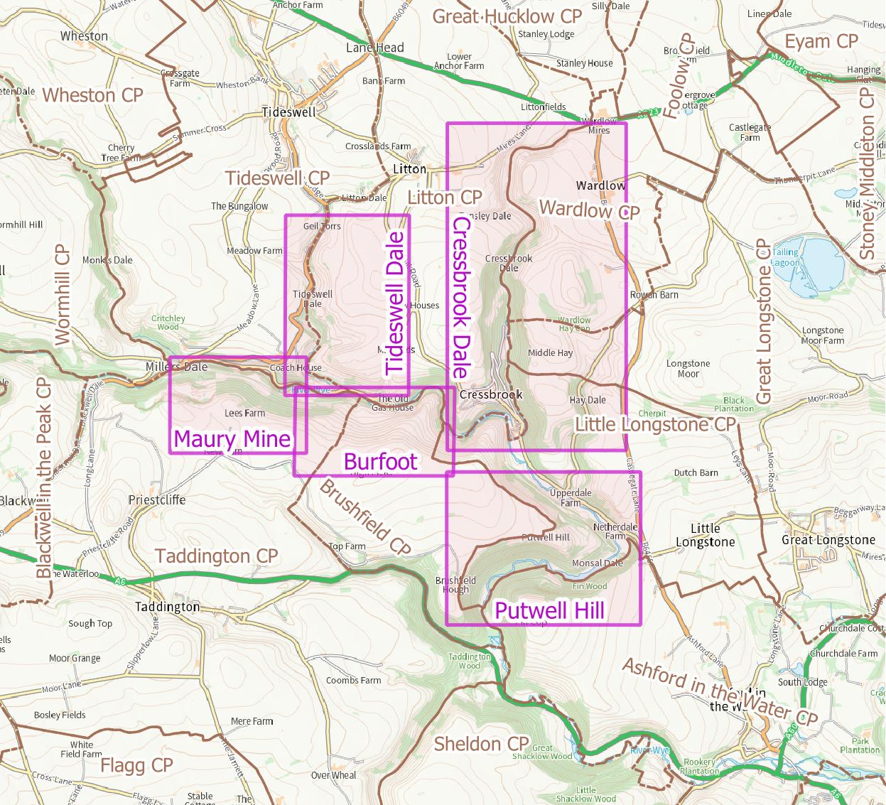
This field guide contains two itineraries around mining history sites (and some geology and other historical notes) near to Millers Dale in the Peak District: Maury Rake and Tideswell Dale. Three others are in preparation and will be added in due course…
The main download is a zip file which contains a written field guide, maps, and digital location data for GPS devices.
If you make use this guide, please let me know by adding a comment. You can also post corrections and suggestions (but please note I am unlikely to respond to requests for more information).
I have written a series of field guides to mining history (and some geology and other historical notes) for selected areas in the Peak District. Each guide consists of a written field guide, maps, and digital location data for GPS devices.
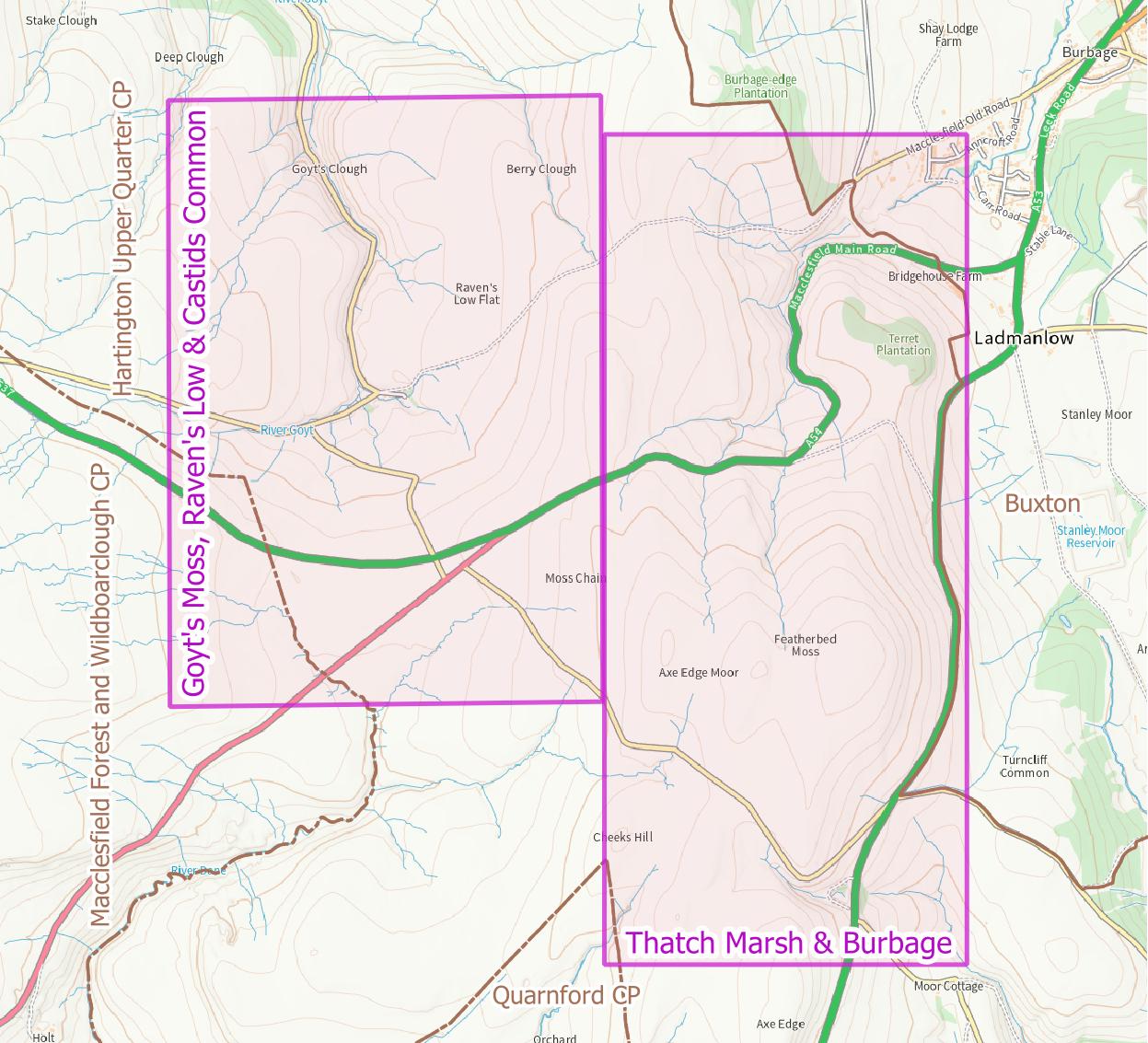
The third looks at coal mining west of Buxton, specifically the area around Derbyshire Bridge in the upper Goyt Valley, above Burbage, and across to Thatch Marsh and Cisterns Clough. Version 1.0 published January 2024.
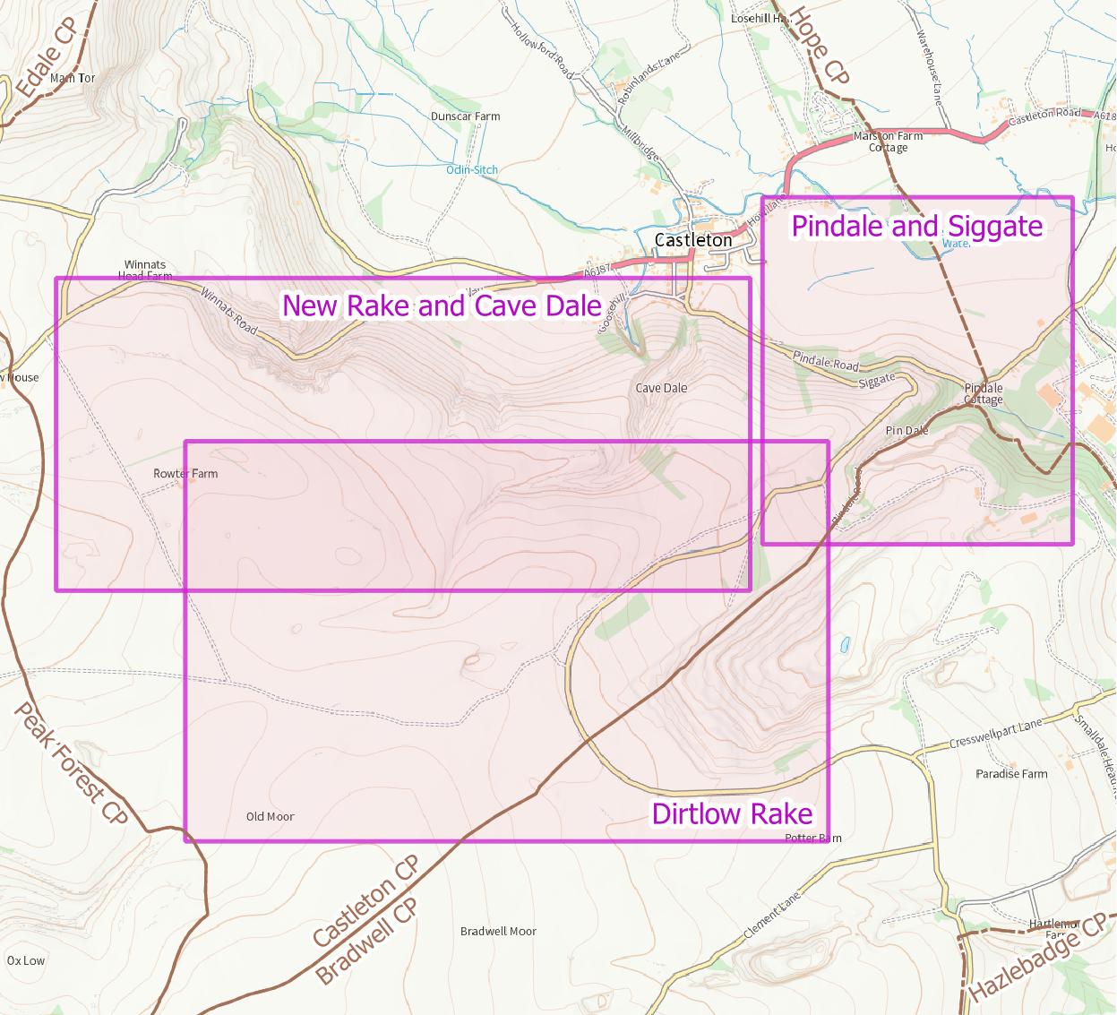
This field guide contains three itineraries around mining history sites (and some geology and other historical notes) near to Castleton in the Peak District: New Rake and Cave Dale, Pindale and Siggate, and Dirtlow Rake.
The main download is a zip file which contains a written field guide, maps, and digital location data for GPS devices.
If you make use this guide, please let me know by adding a comment. You can also post corrections and suggestions (but please note I am unlikely to respond to requests for more information).
Digital elevation models are expressions of the surface of a planet as data. These, and the software to view or process the data, have become freely available over recent years. The software ranges from easily usable online viewers to PC-based tools requiring intermediate levels of IT skill. This all makes for an interesting and useful resource for people interested in mining history, whether as a casual interest or as a more focused amateur historian. This article seeks to provide an introduction to the topic and to illustrate what is possible. A shortened version is being published in the Peak District Mines Historical Society (PDMHS) members’ newsletter. If you find this article interesting, you may be interested in joining and participating in membership activities, but we also have public activities when pandemics allow.
I am avoiding technical detail, and not providing a “how to” guide; there is an abundance of information available on the web which should suffice, although a mining history focused “how to” guide may be created for PDMHS members if there is interest.
A Brief Introduction to Digital Elevation Models (and Lidar)
I am using “digital elevation model” (hereafter: DEM) as a generic term as well as two more specific terms: “digital terrain models” (DTM) and “digital surface models” (DSM). A DSMs give the surface with things on it – trees, buildings, walls, etc – whereas DTMs, in UK parlance, show the ground level (in the USA, a DTM is augmented with information about surface features such as rivers). Someone with an interest in forest canopies would normally be interested in a DSM, whereas we mining history people are much more likely to be interested in what is beneath the vegetation, hence in DTMs.
DEMs are usually created using the data from flying aircraft, with a considerable amount of sophisticated data processing to get from the raw data to usable DEM data. Radar has been used, although Lidar (an acronym for “light detection and ranging”) is the most likely source of DEMs which we will use. Lidar and radar use similar techniques: bouncing light or radio waves off objects and measuring the pulses which arrive at the sensor to “see” objects. Lidar equipment is extremely expensive. A cheaper alternative is to use photogrammetry, which entails taking numerous overlapping photographs from an aircraft, and using software to work out what the surface elevations must be to cause the observed changes between adjacent photographs. Photogrammetry can be achieved from professional grade unmanned aerial vehicles (aka “drones”). See, for example the 3D model of Magpie Mine, with online viewer, created by Peak Drone Imaging. Some specialist providers also fly Lidar drones.
What are DEMs Useful For?
Before listing what we can use DEMs for, it is fair to mention that even the higher-resolution images are no substitute for an experienced archaeologist on the ground. Such a person will see things, feel them under their feet, draw inferences from changes in vegetation, and observe traces of mineral, etc. Unfortunately such people are in short supply. Aerial photographs may also be more revealing than images created from DTMs, especially high resolution black and white images, but also when the character of vegetation is shown, although the best resolution of freely available aerial photographs is generally not good enough to compete with the latest Lidar-based DTMs.
Fieldwork (preparation) from your desk chair: before venturing out, 2m or higher resolution DTMs, can be a useful way of “seeing” what is there. This kind of prospecting can be really useful when the terrain is difficult. Alternatively, there may be places of interest on private property with no access.
Seeing though undergrowth is a major advantage of DTMs, making visible what would otherwise remain fairly well hidden.
Validating grid references and sketch maps; there are abundant imprecise locations from before the days of GPS, when sometimes an approximate 100m grid reference was the best that could be achieved. This also applies to British Geological Survey maps, which are often based on very old surveys and locate veins quite inaccurately.
Visualising the 3D character of the landscape is one nice application, and one which works even with 50m spatial resolution. This can be either quite subtle shading on a flat map, to given an impression of shadow, or a more virtual-reality-like presentation. Contour lines are really in this category too.
What Data is Available?
There are several good sources of freely-downloadable data (but with some licence terms):
Ordnance SurveyOS Terrain 50 is a DTM with a spatial resolution of 50m. It is not available as GeoTiff (see below), but in alternative grid-based formats and as contours.
NASA mapped almost the entire land surface of planet Earth in the Shuttle Radar Tomography Mission (SRTM) at 1 arc second spatial resolution, which is approximately 30m. You can browse maps online and download the data using the USGS Earth Explorer, and there is a SRTM downloader plugin for GQIS (see below).
The Environment Agency has surveyed many parts of England over the last 20 years, at a range of spatial resolutions between 2m and 0.25m. This work was particularly driven by a desire to model and predict flooding, so the smallest resolution surveys closely follow draining networks near large urban/suburban areas such as Sheffield. Since 2016 they have been undertaking the National Lidar Programme, which will complete its survey of the whole of England at 1m spatial resolution in 2021/2 (Lidar surveys are taken during the winter months while vegatation is largely dormant). The vertical accuracy is claimed to be below 0.15m and both DTM and DSM datasets are available. This is all available under an Open Government Licence. This is outstanding!
While the OS and NASA datasets are useful for visualising the physical geography, a spatial resolution of 1m or less is essential for picking up mining historical features other than large scale open-casting. Consequently, most of the rest of this article will look at the Environment Agency data, in particular the 1m National Lidar Programme data as it is available in nice square blocks, whereas the 0.5m and 0.25m surveys are quite limited in coverage and tightly follow streams and rivers.
Visualising DEMs
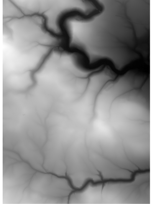
The simplest way of representing a DEM is as a square grid of altitudes, and this is the most likely way in which data is provided. The grid spacing, known as the spatial resolution, typically varies from around 100m down to 0.5m, or sometimes as small as 0.25m. A grid of elevations is also quite easy for computer programmes to process. The most favoured current format is GeoTiff, which is an extension of the Tag Image File Format (Tiff) to include data about the geospatial location which the data relates to. The simplest way of rendering a DEM for viewing is to have the elevation values correspond with different brightness values, from black (lowest elevation) to white (highest elevation), so GeoTiff is a neat solution. A bit of desk research will turn up lots of alternative file formats. Fortunately, most geospatial software can handle several of them.
Unfortunately, just opening one of these GeoTiff files on your PC will usually just give you what looks like a plain white image, but with the right software we can get something looking a little surreal or medical.
(All images are linked to a larger version)
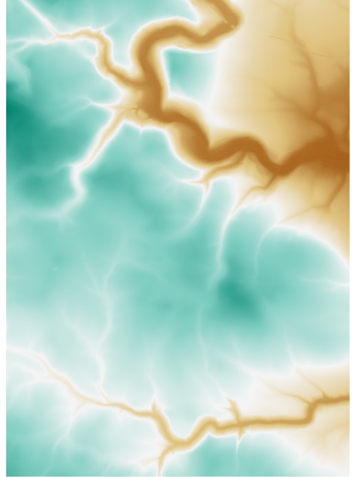
We can do a bit better by creating a pseudo-colour image, where the elevations are mapped to a colour. The colour scheme can be semi-naturalistic like a traditional atlas, a simple grading from one colour to another via white, a rainbow or a garish scheme designed to highlight a particular elevation range.
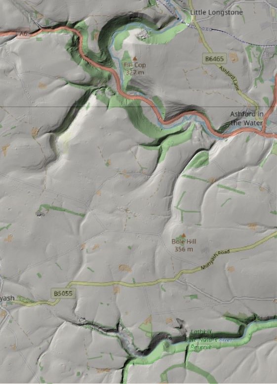
One really effective technique is to generate “hill shading” by simulating light and shadow from an imaginary sun. If you visit the OS Terrain 50 web page, there is an interactive map where you can adjust the azimuth to alter the hill shading. Hillshade works well when overlaying a base map or aerial photography.
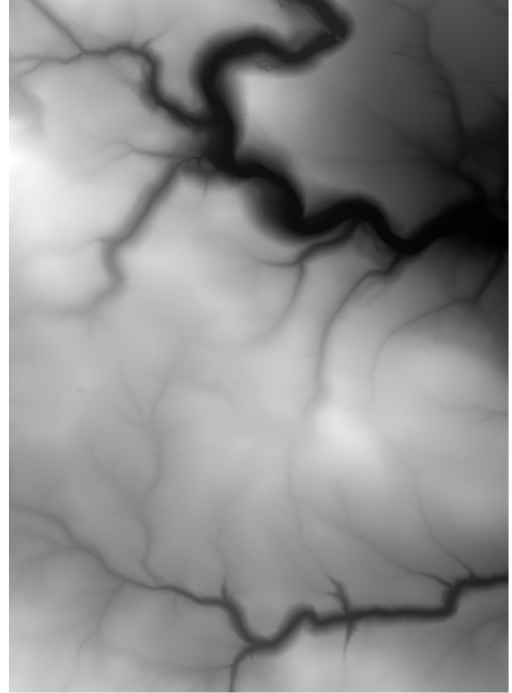
Grey-scale representation of a DTM. Monsal Head is at the top and Lathkill Dale at the bottom
Wye to Lathkill Pseudocolour DTM
Wye to Lathkill Hillshade Overlaying OpenStreetMap
Hill shading turns out to be quite effective at picking out even quite slight surface features with the higher resolution DEM data. When hill shading is used to augment a map, steep slopes can appear very dark, so people often use multi-directional hill shading, with three or more imaginary suns all shining at the same time. This sounds very unrealistic, but the images are pleasantly usable.
Some other ways of representing a DEM are as contours, which are not so easy to work with “as data” but super if you are map-making, and as the surfaces of 3D objects, which would be useful for creating photo-realistic images and “virtual reality” environments. This article will not look at 3D visualisations.
Visualising DEMs on the Web
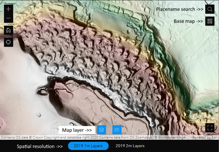
My top recommendation is to use the Environment Agency Geomatics Team’s Lidar Composite viewer, but there are other services to explore via their Open Data Products page. This is a very interesting resource which includes clear information about Lidar, the accuracy of the data, and the way raw data is turned into a DTM or DSM. At the time of writing, the latest data which is included is the “2020 Composite”, but this will change as the National Lidar Programme progresses (link to catalogue of all completed and planned surveys).
Environment Agency Lidar Composite Viewer, with key controls annotated: Map layer, Base map, Spatial Resolution, and Placename Search.
At this point, I urge you to go and explore! The most important controls are the spatial resolution selection and the map layer. Once the Map layer control is opened, click on the little eye symbols to switch different effects on and off, or on the three dots to change the opacity of the layer. Experiment with hill shading, pseudo-colour, overlaying hill shade onto base maps (you will have to decrease the opacity of the hill shade), and looking at slope and aspect. The area shown in the image, above, is Grin Low, above Poole’s Cavern in Buxton, providing a dramatic illustration of the legacy of lime burning which is only partially evident as one walks around the woodland. The Thatch Marsh and Burbage Colliery area, not far to the West of Grin Low shows the causeways and pit locations quite clearly, as well as the pack horse hollow-way leading from the pits towards the lime kilns where much of the coal was consumed. The area and its history is thoroughly described in “Coal Mining near Buxton: Thatch Marsh, Orchard Common and Goyt’s Moss” by John Barnatt, in Mining History 19-2 (not currently online) which has several maps drawn from proper fieldwork, which make for an instructive comparison with Lidar armchair exploration.
An alternative viewer is the Environment Agency Survey Open Data Index Catalogue. This gives access to more datasets, including DSMs (although only in the 2017 Composite, not the 2019 version), but I don’t find it quite as pleasant to use.
For the More Adventurous – QGIS
QGIS (formerly Quantum GIS) is open source software with professional-level geographical information system (GIS) capabilities. Software with such power comes with challenges, and I would only recommend people who are confident IT users even taking a look. I hope those who are confident will be able to repeat the following examples, and are maybe motivated to learn more. There are a lot of resources explaining how to use QGIS on the web; just be aware that the latest version is QGIS 3, and many resources refer to the previous release. If you do download QGIS, choose the latest “long term release” version. I am going to use some more technical terms in this section, and will not explain them all, expecting readers can do their own web searches.
Before doing anything else, I recommend adding OpenStreetMap as a base map layer, if only so you know where you are! This is achieved by adding an “XYZ Tiles layer” (see this guide). The URL to add is “http://a.tile.openstreetmap.org/{z}/{x}/{y}.png” (without the quote marks, but with those curley brackets). There are lots of XYZ servers available – try a google search – but the Bing Maps satellite imagery service is a good companion to the OpenStreetMap: “http://ecn.t3.tiles.virtualearth.net/tiles/a{q}.jpeg?g=1“.
The starting point for all which follows is QGIS with a map in view and two panels – headed “Browser” and “Layers” – on the left hand side. If these panels are not visible, use menu View > Panels.
Getting Data for QGIS
I am only going to consider using Environment Agency data, for which there are two ways of using the DEMs in QGIS: downloading GeoTiff files, and accessing a WMS map tile server. Once set up, the WMS approach is quicker and easier but you get less control over how the DEM is rendered. Consequently, I suggest using the Defra Survey Data Download service. The workflow for using this site is generally: draw your area of interest on the map, click “Get Available Tiles”, then choose which dataset you want. Ignore the shapefile upload option; the icons for drawing your area are just beneath the upload grey box. This catalogue covers all the published datasets, with downloads being 5km x 5km squares. At 1m spatial resolution, that amounts to 5000 x 5000 = 25 million data points, so even these tiles are quite large files.
Once downloaded, you can just drag-and-drop the file into QGIS. If you do this, you will see that QGIS chooses a grey scale for each based on black = the lowest elevation and white = the highest elevation. This makes things look blocky if you load several 5km square tiles since each has a different min/max elevation. This can be fixed quite easily, but doesn’t matter for some uses (see below). I generally work with the OpenStreetMap and satellite imagery as the bottom layers and put DEM layers above (and the notes below assume this).
Playing with Hill Shading, Pseudo Colouring, and Overlaying Maps
For this section, we will work within a single 5km tile. I chose the SK16NE DTM from the 1m National Lidar Programme (aka DTM_1565) to work through what follows, which has Magpie Mine almost at the centre. The Magpie Mine is easily accessible and has been thoroughly surveyed and described, so it is a good place to see what Lidar data can (and cannot) reveal. Choose a place you know!
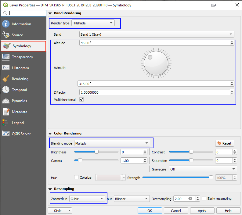
All of the following is achieved by double-clicking on the DTM layer in the “Layers” panel then choosing the “Symbology” option. When you open this up, it will not look exactly as below, because the default “Render type” is the rather boring “Singleband gray”. Change this to “Hillshade”. Also change “Zoomed in” to “Cubic”; if you don’t do this, the appearance when zoomed in looks a little bit like linen (this is an easy thing to forget). You must either “Apply” the changes or “OK” to close the properties window for the settings to take effect.
To begin with, “Multidirectional” will be un-ticked. In that state you can play around with the altitude and azimuth (compass direction) of the imaginary sun for which the shading is created. It will quickly become clear that different features are revealed for different angles, but that if you are interested in showing several features, there isn’t a good answer. This is where multidirectional hillshade comes in; it combines the effect of several simulated suns (3 for QGIS). Since the hillshade algorithm uses gradient and aspect to determine the shade of grey, it will work if you have several 5km tiles loaded.
To combine the hillshade with either the OpenStreetMap, change the “Blending mode” from “Normal” to “Multiply”. This merges the DTM and the map images so that the map appears to be draped over a 3D surface. I find this the best way to interpret features in relation to landscape features. A similar effect can be obtained with the Bing aerial photography layer, although if there are buildings and trees in the area of interest, it may be better to use a DSM instead. Combining the DTM and aerial photographs can often be very revealing since the photographs can show variations in vegetation or surface material in topographically indifferent ground, whereas the DTM reveals aspects which are indifferent in ground cover.
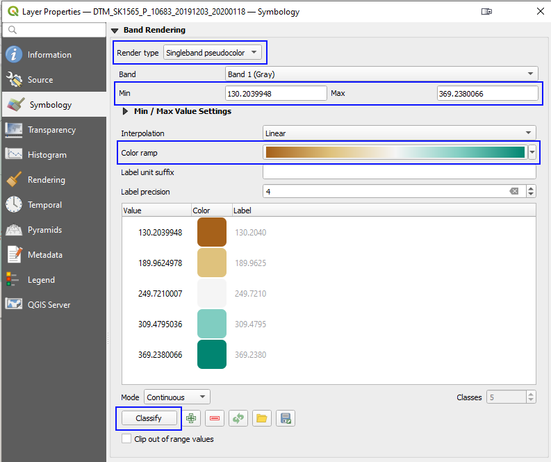
An alternative to hillshading is to set the “Render type” to “Singleband pseudocolor” (the TIFF images are “single band” because there is a single value for each pixel, which corresponds with the height, whereas colour photographs usually have three bands with separate red, green, and blue values per pixel). The magic button is “Classify“! There are lots of colour schemes to experiment with – change “Color ramp” – but most are horrible.
The Min/Max values can be useful to limit the colour range to the elevation range in a particular area of interest. A 10m range can nicely bring out spoil heaps and hollows. These values can also be used to force several 5km tiles to have the same colour scale, so to appear seamless.
Most of the other options will not be useful for general experimentation, but the brightness/contrast/saturation slides can be useful for preparing images for print.
Some tricks:
Right-click on the DTM layer and choose “Duplicate Layer”. Now set one of the two layers to be hillshade and one to be pseudocolour. This can really bring out relief.
Make your own multidirectional hillshade by duplicating the DTM layer 2 or more times and setting the azimuth separately on each layer. This can help to reveal features which are not showing nicely with the QGIS fixed azimuth angles.
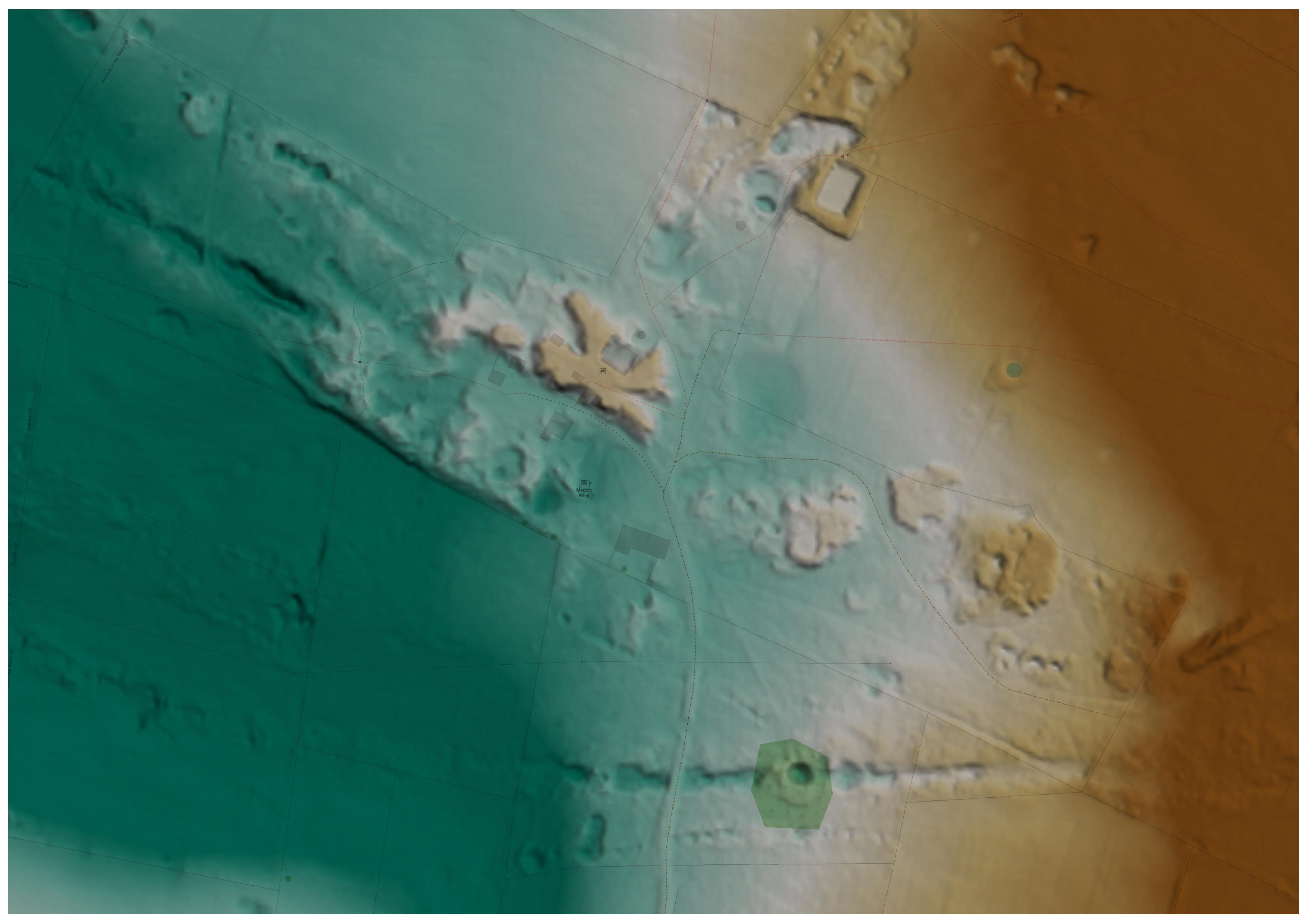
Here is a composite image of Magpie Mine using the DTM mentioned above (so the buildings have been magically transported away). The spoil heap near the 1869 engine house and the reservoir are easily seen, as are the main veins outside the heavily re-modelled central area, but can you make out the four gin circles and the crushing circle? Gin/crushing circles are much easier to see on the ground than from a DTM when the terrain is quite flat. How about the covered flue from the square chimney to the long engine house, the slime ponds and dressing area, and the straight tramroad from Dirty Redsoil into the centre of the main site? In this case, adding the pseudocolour actually makes it harder to make out the more subtle features where the changes in slope and aspect are more significant than changes in elevation.
Composite of Magpie Mine comprising OpenStreetMap base map overlain by a multidirectional hillshade and a single band pseudocolor constrained to the altitude range of 315m to 325m. (Click to open larger image)
QGIS can also generate contour lines from DTMs; change the “Render type” again. The contour options are fairly self-explanatory and work well down to as low as 1m interval with the National Lidar Programme data. The “index contour” can be used to make every 5th, 10th, etc contour be styled differently. The “input downscaling” setting default of 4 usually works well; this smooths out the contour lines to make them less jittery as the limits of the spatial resolution (and to a lesser degree the vertical accuracy) come into play. Larger values make for smoother contours.
I find there isn’t a single magic setting which works for all cases; different sites and different exploratory questions indicate different settings, but there is enough variety and power in what QGIS provides that there is usually a satisfactory approach, within the limits of the data.
Creating Terrain Profiles
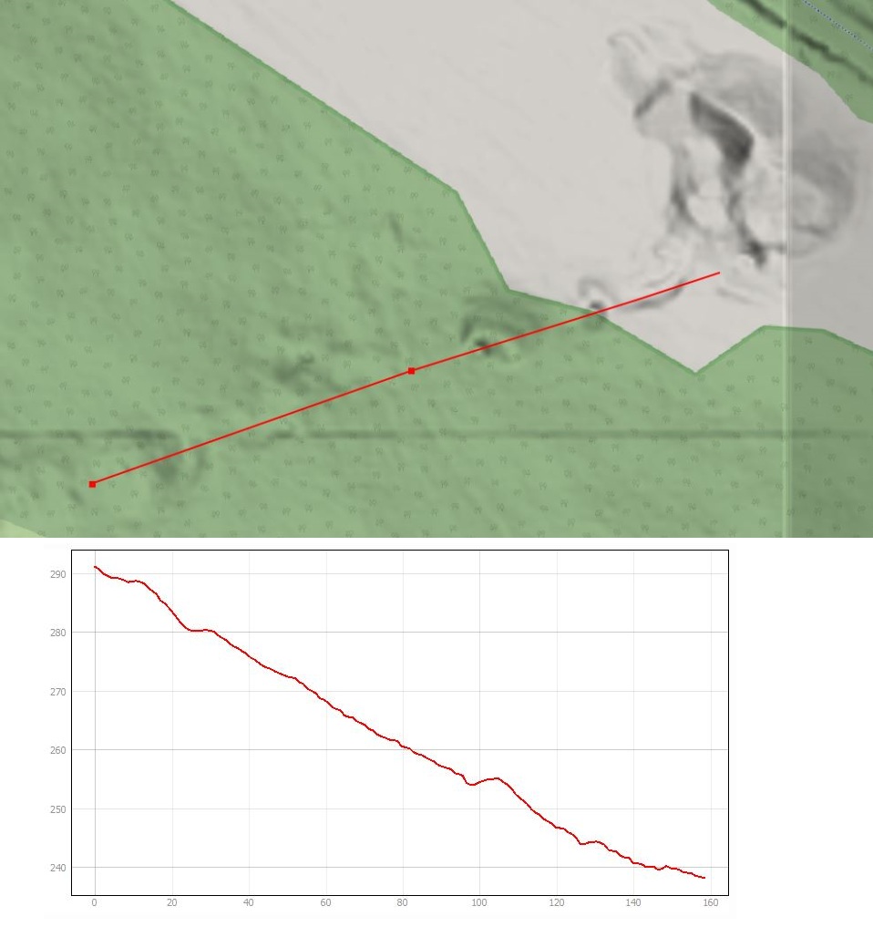
Since the DEM encodes height on a grid, it is possible to construct profiles. The standard QGIS plugin “Profile tool” is the easiest way of doing this and there are a few more advanced plugins available. The tool is quite self-explanatory, so here is an example without a “how to”. The area around Wass’ Level (also known as Moorhigh New Level) on Maury Rake is in an accessible grassland location just South of the old Midland Railway bed through Millers Dale. A visit to the site allows the spoil heaps and settling ponds to be easily seen along with the presumed collapsed level at around 245m elevation, at the edge of the woodland. The Lidar image reveals some interesting features up-slope which cannot be seen from the open area but the elevation helpfully reveals enough to motivate a bit of struggling through the undergrowth. Could the feature at 255m be evidence for the excavation from the surface of a winze down from Wass’ Level to the now-lost Upper Level (destroyed when the railway was build just above it)? The paper entitled “The Maury and Burfoot Mines, Taddington and Brushfield, Derbyshire” by John Barnatt & Chris Heathcote in Mining History 15-3 describes the site and its history.
Aside: the vertical line near the right is just an artefact of having used two DEM tiles which have been separately hill-shaded; the hillshade algorithm can’t work out what the slope/aspect is at the edge of a tile. This can be avoided by combining the tiles into a single layer in QGIS, which should be done for publication but I’ve left it in here as there is educational value in showing and explaining the issue.
The Area Around Wass’ Level (SK149730) on Maury Rake, Millers Dale. (Click for larger image)
Some Oddments…
Once you have got to grips with the basics, there are numerous plugins and processing algorithms to experiment with. The Visibility Analysis plugin uses the DTM to determine those parts of a map which show what can and cannot be seen from a vantage point. There are algorithms which will calculate surface slope and aspect, or roughness (Processing Toolbox > Raster Terrain Analysis); these values can then me mapped to colours using the same technique as above. Mapping slope to pseudocolour does a better job of revealing gin circles than hillshade when the terrain is quite level.
Using a WMS (Web Map Service) is generally more convenient than adding 5km square Tiff tiles in QGIS but the available services provide a combined hillshaded and pseudocoloured image and only a DTM is currently available (things might change). The separate services for 2m and 1m DTM (etc) are:
The following URL may be added as a WMS to discover the extent of coverage without the DEM: https://environment.data.gov.uk/spatialdata/survey-index-files/wms . NB this will not work in a web browser, but the same source can be accessed using an online service via web browser.
The elevation data is available (as opposed to a hillshaded and pseudocoloured image), but only using the ArcGIS Image Server protocol. In QGIS this requires the use of the “ArcGIS ImageServer Connector” plugin, which works but the image redraws rather slowly. The URL to use is of the form: https://environment.data.gov.uk/image/rest/services/SURVEY/LIDAR_Composite_2m_DTM_2020_Elevation/ImageServer.
We can hope that, once the National Lidar Programme has concluded, the WMS provision will improve, along with the rather confusing array of data download, WMS, and online map viewers. Quite a few things changed during the drafting of this article.
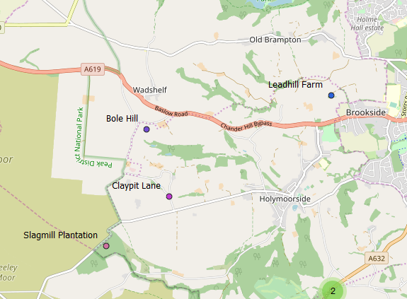
This article describes some informal/experimental work in which various sources of data were processed to find traces of mining history in the names of places.
A few of the results from the place name search, displayed over an Open Street Map
The Geographic Area
My area of interest is broadly-speaking the Peak District and adjacent areas. For practical purposes, I have defined both a detailed boundary and a rectangular bounding box. The latter takes in all of the former, which is defined using Parish (and similar town/urban) boundaries. Since the boundary of Sheffield stretches into outlying areas which are of interest, this way of defining the boundary ends up including the city and Eastern areas. The same is not the case for Greater Manchester. Noteworthy cases where areas outside the Peak District are included are: the Churnet Valley and Alderley Edge.
The bounding box is (E-min, N-min, E-max, N-max): (381355, 340577, 445079, 402069)
Coordinates will either use fully-numerical eastings and northings to 1m, or use 100km letters (SK covers most of the area) and a variable number of digits.
Where source data is chunked according to 100km or 20km tiles, the small excursion of the boundary north of 400000 is neglected.
Data Sources and Pre-processing
All data sources are ultimately from the Ordnance Survey, but with some qualifications:
OS Open Map Local* for NGR squares SJ and SK, was used, limited to shapefile data files “NamedPlace” and “Road”.
OS Open Names* is provided in 20km tiles; CSV files with the following names were used: SJ 84, 86, and 88; SK 04, 06, 08, 24, 26, 28.
OS 1:50,000 Scale Gazetteer is no longer available from OS but I had a copy from 2009 on disk. This contains names which are not present in currently-available OS downloads. It was processed to extract entries occurring in the same area as used for Open Names (the data includes the tile designator).
The Visions of Britain “GB 1900 Gazetteer” (the abridged version) was initially limited to the area extent then an attempt was made to remove entries which are descriptive of features (e.g. “Old Lead Mines”) rather than being names. This is a somewhat subjective exercise. Proper names for lead mines are quite common in this gazetteer; these were left in, although the main intent of the activity is to find place names which had arisen from mining activity, rather than finding named mines.
A final spatial filter was applied in all cases to limit the input data to the “detailed area”.
Search Terms
The range of possible name-parts of interest is split up, largely according to variation-spellings of the same root, but with some “misc” categories which contain various thematically-related words. The categories/terms are given below, with the category name in bold.
coal: words starting with “coal”, “cole”, or “collier”. Historically, charcoal was also referred to this way.
pit: names ending, or having a word ending, in “pit” or “pits”.
lead: words beginning “lead”, “led”, “lyd”, “lidgat” or “lidyat”.
mine: words starting “mine”.
cost: words starting “coars”, “cost”, or “coast”. These could be due to Old English names indicating a mining trial (see PDMHS Bulletin 7-6 pp 339-341).
mining misc: a word beginning with one of “rake” or “raike”, “delf” or “delph”, “gin” or “engine”, or “ochre”.
bole: a word containing either “bole” or “brenn”. The latter catches “brenner”, the operator of a bole.
smelting misc: terms other than “bole”, which signify smelting: “sm.lt” (where . is any letter), “cupola”, “pig”, or “slag”.
misc: catches names with words containing “jagger”, “belland”, “forge”, or beginning with “copper”, “bloomery”, “furnace”, or “furnes”.
While it is clear that these search terms will include obviously-erroneous names, these are not excluded from the results; given the status of this work as “for interest and as stimulus”, this feels appropriate.
Search results were further processed to try to remove unwanted multiplicity arising from either the same name appearing in several sources, and from linear features such as roads having multiple entries. This was done by checking for identical names within 500m. This sometimes fails, as different sources may differ in capitalisation or make composite words such as “Bolehill”.
Three maps were created due to difficulties combining all the options using the Leaflet technology which underpins the web maps. For maps which do not immediately show the names, simply place the mouse cursor over a point.
Some Observations
Some of the search terms will give less-obvious false “hits”, and so all should be taken with some caution; place name specialists rely on written records from far earlier than those used here. Some example false friends are: “coal” might originate from “cold”, although we might reason that local geology makes the former more likely; “lydgate” is often though to derive from Old English “hlid-geat”, a swing gate. I will consider the case of “lyd” in a later post.
Almost all of the hits for “mine” are named mines, with a few exceptions such as “Miner’s Cottage”, “Miners Hill”, or “Miners’ Standard PH”.